Monitoring surgical quality: the cumulative sum (CUSUM) approach
Introduction
Recognizing the social demands of professional responsibility, all medical activities, and surgical ones are not the exception, are currently under strict internal monitoring of their results, usually by risk-adjusted analysis of outcomes (1) facilitating the adoption of required corrective measures. Also, external audits (2) and benchmarking projects (3) have been implemented by scientific societies. Public reporting of outcomes adds a sense of transparency and security to patients and facilitate adequate financial resources to health care institutions (4).
Surgical performance can be improved comparing local outcomes to historical large databases through solid risk models which are constructed on multi-institutional high-quality records. At the time of implementing new surgical programs, no risk-adjusted models are available and, depending on the nature of the innovation, a close follow up in a case by case basis can be necessary. In those cases, close follow-up of outcomes must be implemented on time series analysis either by simple Shewhart chart or CUSUM analysis. This paper aims to review both Statistical Process Control (SPC) tools in health care and to provide some examples based on our own surgical experience.
The SPC tools
SPC tools are mathematical instruments originally developed for the industry to monitor the quality of manufacturing processes (5). Among SPCs, Shewhart charts, exponentially weighted moving average (EWMA) chart, G-chart, Funnel plots and CUSUM plots are the most relevant (6,7). All of them are based on time series analysis of specific results or outcomes.
Choosing the right tool
Difficulties identifying the most appropriate statistical chart for quality control has limited its use in clinical settings (8). Depending on the characteristics of the variable to be measured, one or another tool should be used. When the variable “counts” the number of similar items in a single category, something that is represented as yes/no, passed/failed,… or Attribute data, different types of Shewhart charts (p-chart, np-chart, c-chart, u-chart) are specific tools for its analysis and EWMA chart, CUSUM chart, real time contrast charts or time series model can also be used. When analyzing the values resulting from the measurement of continuous variable or Variables Data, again different types of Swhewhart charts (X-bar and R chart, X-bar and S chart, ImR chart or XmR chart), three-way chart and regression control chart are the appropriated ones. EWMA chart, CUSUM chart, real time contrast charts or time series modeling can also be used for Variables data’s analysis (9). Despite this difficulty, the Shewhart p-chart, the simplest of all the instruments, is increasingly used to monitor Plan-Do-Study-Act (PDSA) cycles in healthcare (10).
Setting the control limits
Even in the so-called stable processes (6), variations can be observed that do not require any corrective intervention. Without statistical control limits, overinterpretation of the results can lead to inappropriate decisions to normalize outcomes that do not require any intervention (7). Different methods have been developed to establish the limits (11). In clinical settings, values derived from previous large series analysis (12) or based on expert agreement should be used. For instance, Je et al. (13) evaluated the performance of three residents while training on endotracheal intubation after agreeing that 90% of successful intubation was the goal to achieve and considering 80% as inadequately low. No matter which is the value you choose, it must make clinical sense.
Defining the stage
Before starting the analysis, a precise definition of the area in which the measure will be implemented is mandatory. In surgical settings, variables related to the surgeon, to the department or any specific part of it, to the hospital or a group of hospitals sharing similar conditions can be analyzed. However, analyzing single surgeon performance is usually not recommended unless measuring very specific procedures highly linked to individual practice (14). Most outcomes are not dependent on the work or the decision of an individual, but the result of a multidisciplinary team action. Therefore, analyzing variables that consider the whole process is recommended. For instance, it can be interesting to analyze different outcomes related to a new treatment in certain tumoral stages (morbidity, mortality, QOL, pain, etc.).
Defining variables and the benchmark value
As mentioned before, SPC tools can work with dichotomized or continuous variables. Of course, these variables can be discrete events or composite scores but always quality indicators of the target outcome. Therefore, systematic literature reviews and formal judgment are necessary to identify the best quality indicators in each situation. In a second step, it is necessary to assess the validity and practicability of the chosen variables. Simple and easy to use variables such as mortality; conversion rates for minimally invasive surgery; requirement of blood transfusion, etc. or in cancer surgery, whether lymphadenectomy was performed or not or whether the standard number of lymph nodes were removed are frequently controlled parameters. Also, composite parameters can be controlled. For instance, aggregates of postoperative complications like the occurrence of type IIIa major complications that did not required general anesthesia for its treatment (6,15).
After defining the variable under control, determining the “benchmark” value is mandatory. This value can be determined by the quality manager (13) or can be estimated using the constant value obtained when the process is running correctly. In a dataset with a normally distributed mean, this standard value is the mean obtained when no out-of-the-statistical-limits cases had occurred (16).
The Shewhart control chart
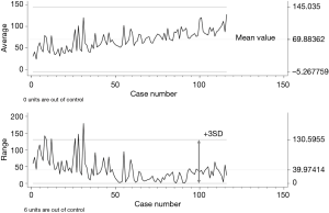
In this simple chart, variable values are plotted against the timeline (Figure 1). Up to ten types of Shewhart charts can be identified. Two of them are frequently used and are based on the mean value of the measured variable (X-chart) or on the standard deviation (SD) of the range of values (R-chart). In Figure 1 both charts show multiple variations. All are within the control limits except for 6 cases in the R-chart. Further analysis of those cases discovered that in all of them local invasion of vascular structures obliged to prolonged surgical times. To note is that not out of control cases occurred in the X-chart while some cases appeared in the R-chart, meaning that both types of charts are complementary.

Defining the control limits in Shewhart charts
Johnson in 1961 (17) defined a widely used process for statistical calculation of the limit’s values. It is widely used due to its simplicity. The basics consist in calculating the SD of the series. Once known, limits are established at ± 3SD (or 3 Sigma) including 99.7% of the normal fluctuations of any variable. Therefore, any point that exceeds the limits is extremely rare and should be evaluated. It is assumed that control values are stable all along the series and that all points within limits are equal and good meanwhile anything out of limits is bad. Not all of the values are, however, equal. In fact, the closer to the mean, the better the values should be (6). This comes from the non-medical industry in which production must comply with very strict margins and no wide changes are expected. Something that, sometimes, it is not true in health care, although reduction of variability is also a priority in clinical settings.
Despite this limitation, the Shewhart chart has clear advantages over other quality control tools:
(I) It is intuitive and therefore easy to understand. The R-chart of Figure 1 shows that performance before case number 35 was irregular and 6 cases were clearly out of standard. After that, performance was much more regular although the series includes cases with different levels of difficulty and performed by different surgeons. On the other hand, the X-chart does not detect cases out of control but an imaginary line of performance points upward getting close to the upper limit meaning that operative times are increasing. Therefore, in the next cases, a close monitoring of performance would be mandatory to control the trends towards prolonged surgical times, helping to reach a more stable (around the mean value) performance.;
- It provides real time monitoring of the measured event;
- It can be created despite the final population is unknown since the numbers are increasing over time.
Cumulative sum quality control charts (CUSUM charts)
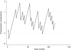
Page proposed the first CUSUM charts in 1954 (18). Since then, several modifications have been introduced (11). CUSUM graphs are intended to monitor the deviations of individual samples results (X values) from a target value. This target value is aim of the process (6). The chart displays a curve that is the result of adding all these deviations, case after case, around 0. Cases appear as dots in the curve organized along the x-axis which is the timeline. Therefore, every point in the curve shows the sequential monitoring of cumulative performance over time. The system rewards the correct or positive outcome(s) (according to the defined variables and binary values of it) and punishes the negative or wrong outcomes (1-s). When the situation is “in control”, the departures caused by random variations cancel each other numerically. In the “out of control” situation, departures from the target value tend to be unidirectional, so that the sum of departures accumulates until it becomes statistically identifiable. Therefore, the curve will display any slow and small but constant change in the quality of the process that depart from the defined benchmark control. In CUSUM charts, curves moving upwards have positive meanings and downwards negative.
Building a CUSUM chart
There are several methods to build a CUSUM chart because there are different types of data distribution. This fact makes possible the analysis of continuous or binomial variables using the same methodology. Independently of the distribution of your data, CUSUM charts will be developed under the same basic concepts but being parameters and coefficients different depending on your data (16).
Assuming that the data are normally distributed or transformed into normally distributed ones, the requested conditions for designing CUSUM charts include (16):
First, defining the acceptable and unacceptable limits of the variable under evaluation. Both can be defined by the quality manager or calculated after collection of certain amounts of cases. The following must be defined:
- Mean or benchmark value: the mean value of the variable when everything is “in control” also known as p0 or µ0;
- Mean value of the “out of control”. The value from which outputs are non-acceptable or p1 or µ1.
Based on the previous values, the system will calculate the model constant or stable parameter along the process:
- Standard error (SE): SE or the SD of the mean (in control or benchmark value). When just one set of data is being monitored at the same time, the SE is equivalent to the SD. When several sets of data are being monitored at the same time, SE should be adjusted knowing that SE = SD/√(() n) where n = total sample size.
Other data that should be defined by the quality manager or accepted using standard values are the following:
- The average run length (ARL). ARL is defined as the expected average number of consecutive elements required to obtain a false positive alarm when the situation is still “in control” (11). As mentioned in the definition, ARL is equivalent to the false positive rate (FFR) or the type I error (6,11) and it is normally set between 20 and 1,000 in health care systems. The figure depends on the number of data expected to be monitored (11). For instance, for a FFR of 5%, ARL is set at 20 (calculated as 1/0.05); for FPR =0.1%, ARL =1,000. Most often, in health care, type 1 error is set at 0.1 (6). It is important to know this value because mathematicians have developed multiple tables to manually calculate the values to build the curves. In those tables, ARL value is key to adjust the rest of the parameters.
- Type 2 error is usually set at 0.1 (6).
Statistical parameters:
- The reference value k, or the sensitivity of the graphic, is calculated based on p0 and p1;
- The decision interval h that will create the limits for raising an alarm is calculated based on ARL or type 1 error, based on type 2 error and k. h1 is the interval between unaccepted values and h0 is the interval between accepted values. Because both types of error are normally set equally at 0.1, both intervals are equal and only one line (positive and negative) will appear (6).
In the statistical programs that can create CUSUM curves, normally defining p0 and p1, calculating the SE, setting the errors at 0.1 and defining whether it is a binomial or continuous variable are enough to build the curve in most cases. In EXCEL® it is possible to calculate all the variables (19) although the program has the possibility of making it automatically.
There are different types of CUSUM charts. The tabular or algorithmic one is especially interesting because it displays the influence of the negative and positive deviations from the benchmark value in every point of the curve. It plots two one-sided cumulative sums for every point giving a clear information of what was more relevant for the output in a certain point: the positive or the negative cumulative values. Sometimes the information is not presented on lines but in bars (9,20).
Calculating the control or decision limits: what shift from the benchmark value do we want to detect? Where do we want the action limits set?
Because CUSUM curves are easily understandable, in most cases no control limits are shown (Figure 2). This is also known as a standard or non-risk adjusted CUSUM chart without limits. However, depending on the distribution of your data, different methods should be applied to calculate those limits (16).

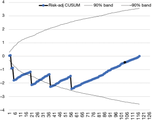
The most usual system to build the decision interval is using the h value (16). However, the most sensitive control limits are defined by the V-mask. The V-mask is a V-shape shadowed area drawn in the interest point of the curve, normally the last value. It marks the positive and negative lines of maximum and minimum accepted values along the curve. Frequently, the mask is calculated using the SE of the plotted variable (9) although risk-adjusted limits can be calculated (Figure 3).

Risk adjusted or non-risk adjusted CUSUM chart
In the non-risk adjusted chart, all recorded outputs have the same risk all along the time-series. Due to the cumulative sum of data, the line swings around the O value when it is under or “in control”. In this chart, control limits are normally calculated using the h value.
However, in health science, risk is barely uniform. Thus, a good quality control tool must consider variations. The risk adjusted CUSUM chart introduces the individual risk into the equation. For instance, a thymoma showing evidence of superior vena cava invasion has a higher risk of having an intraoperative bleeding than a non-invasive thymoma (Figure 3). Therefore, if no bleeding occurs during the procedure, the system should reward the absence of bleeding. In this type of charts, defining a V-mask is the adequate way to set the decision limits (6). Individual risk can be estimated through risk modelling (21). In the absence of reliable risk models, recruiting some cases and using the h value could be a useful initial approach.
Discussion
A key aspect of continuous quality improving is measurement, analysis, and interpretation of variation (22). SPC are statistical tools that identify the normal variation within a process or common cause variations, and, at the same time, they set alarms when variations in the performance of the process seem to be statistically out of control due to identifiable reasons. Therefore, SPC help us differentiating between variations needing no correction and causes of variation that should be identify and corrected. The control chart is a guide to continuous evaluation (22). The basic element of any SPC is the graphic plotting of a control chart. In any of these charts, the most important lines are the central or benchmark value (most often the mean value of the distribution) and the control limits when they are needed. Although intuitive and apparently simple, an important amount of statistical work is needed to develop any SPC (19).
The Shewhart chart gives information regarding an individual point in the graph; in CUSUM charts, each value summarizes what is happening in the current and all the previous points in the curve. This makes CUSUM charts especially useful for detecting very small changes. Normally, changes in the range of 1 Sigma can be detected but shorter variations between 0.2 to 2 Sigma can be detected through specific adjustments. This makes CUSUM the most powerful tool for quality control of any situation in which minor changes are very relevant as in clinical settings. Furthermore, after mathematical comparison, CUSUM charts (more specifically risk adjusted V-mask CUSUM charts) seem to be more efficient than the rest of the medical quality control tools detecting changes both in rare and frequent events (6,23,24).
Charts have limitations related to defining the decision interval. When creating the Shewhart charts, control limits are fixed on ± 3SD according to the initial outputs recorded. Although they can be adjusted when data are variable (6), most of the times they are used on a fixed basis. The main limitation for CUSUM charts is the need of a certain number of cases to establish the initial SE to proceed with the analysis and the lack of risk modelling in many instances. That means that before starting a new program, acceptable and non-acceptable standard limits must be clear, well stablished and making clinical sense.
Arguably the best way to evaluate a new program should follow three steps. A preliminary evaluation by Shewhart chart is acceptable to analyze the initial cases. After more cases are performed, decision interval can be fixed and non-risk adjusted CUSUM chart expanded. Finally, with a higher number of cases, all the information needed to create the risk-adjusted CUSUM chart can be available.
Acknowledgments
Funding: None.
Footnote
Provenance and Peer Review: This article was commissioned by the Guest Editors Mirella Marino and Brett W. Carter for the series “Dedicated to the 9th International Thymic Malignancy Interest Group Annual Meeting (ITMIG 2018)” published in Mediastinum. The article has undergone external peer review.
Conflicts of Interest: Both authors have completed the ICMJE uniform disclosure form (available at http://dx.doi.org/10.21037/med.2019.10.01). The series “Dedicated to the 9th International Thymic Malignancy Interest Group Annual Meeting (ITMIG 2018)” was commissioned by the editorial office without any funding or sponsorship. The authors have no other conflicts of interest to declare.
Ethical Statement: The authors are accountable for all aspects of the work in ensuring that questions related to the accuracy or integrity of any part of the work are appropriately investigated and resolved.
Open Access Statement: This is an Open Access article distributed in accordance with the Creative Commons Attribution-NonCommercial-NoDerivs 4.0 International License (CC BY-NC-ND 4.0), which permits the non-commercial replication and distribution of the article with the strict proviso that no changes or edits are made and the original work is properly cited (including links to both the formal publication through the relevant DOI and the license). See: https://creativecommons.org/licenses/by-nc-nd/4.0/.
References
- Bruce J, Russell EM, Mollison J, et al. The measurement and monitoring of surgical adverse events. Health Technol Assess 2001;5:1-194. [Crossref] [PubMed]
- Available online: http://www.ests.org/_userfiles/pages/files/European%20Institutional%20Accreditation.pdf
- Varela G, Molins L, Astudillo J, et al. Pilot benchmarking study of thoracic surgery in Spain: comparison of cases of lung resection and indicators of quality. Arch Bronconeumol 2006;42:267-72. [PubMed]
- Shahian DM, Edwards FH, Jacobs JP, et al. Public reporting of cardiac surgery performance: Part 1--history, rationale, consequences. Ann Thorac Surg 2011;92:S2-11. [Crossref] [PubMed]
- Gan FF. An optimal design of CUSUM quality control charts. Journal of Quality Technology 1991;23:279-86. [Crossref]
- Noyez L. Control charts, Cusum techniques and funnel plots. A review of methods for monitoring performance in healthcare. Interact Cardiovasc Thorac Surg 2009;9:494-9. [Crossref] [PubMed]
- Neuburger J, Walker K, Sherlaw-Johnson C, et al. Comparison of control charts for monitoring clinical performance using binary data. BMJ Qual Saf 2017;26:919-28. [Crossref] [PubMed]
- Thor J, Lundberg J, Ask J, et al. Application of statistical process control in healthcare improvement: systematic review. Qual Saf Health Care 2007;16:387-99. [Crossref] [PubMed]
- Ali Hussein M, Al-Morshedi A, Shomran H. The Comparison between Shewhart Control Chart, CUSUM and EWMA. Technical Report 2013. doi:
10.13140/RG.2.2.34006.34880 . - Koetsier A, van der Veer SN, Jager KJ, et al. Control charts in healthcare quality improvement. A systematic review on adherence to methodological criteria. Methods Inf Med 2012;51:189-98. [Crossref] [PubMed]
- Woodall WH, Adams BM. The Statistical Design of CUSUM charts. Quality Engineering 1993;5:559-70. [Crossref]
- Salowi MA, Choong YF, Goh PP, et al. CUSUM: a dynamic tool for monitoring competency in cataract surgery performance. Br J Ophthalmol 2010;94:445-9. [Crossref] [PubMed]
- Je S, Cho Y, Choi HJ, et al. An application of the learning curve-cumulative summation test to evaluate training for endotracheal intubation in emergency medicine. Emerg Med J 2015;32:291-4. [Crossref] [PubMed]
- Lim TO, Soraya A, Ding LM, et al. Assessing doctors’ competence: application of CUSUM technique in monitoring doctors’ performance. Int J Qual Health Care 2002;14:251-8. [Crossref] [PubMed]
- Seely AJ, Ivanovic J, Threader J, et al. Systematic classification of morbidity and mortality after thoracic surgery. Ann Thorac Surg 2010;90:936-42. [Crossref] [PubMed]
- Allan Chang. CUSUM introduction and explanation. Hong-Kong. Consulted August 22/2019. Available online: https://www.statstodo.com/CUSUM_Exp.php
- Johnson NL. A Simple Theoretical Approach to Cumulative Sum Control Charts. J Am Stat Assoc 1961;56:835-40. [Crossref]
- Page ES. Continuous Inspection Scheme. Biometrika 1954;41:100-15. [Crossref]
- DaniielMotionGraphics. How to perform the CUSUM and CUSUMQ in Excel. Visited August 28/2019. Available online: https://www.youtube.com/watch?v=1PJIQHCbjpo
- Granjon P. The CuSum algorithm - a small review. Available online: https://hal.archives-ouvertes.fr/hal-00914697. Visited August 28, 2019.
- Brunelli A. European Society of Thoracic Surgeons Risk Scores. Thorac Surg Clin 2017;27:297-302. [Crossref] [PubMed]
- Mohammed MA. Using statistical process control to improve the quality of health care. Qual Saf Health Care 2004;13:243-5. [Crossref] [PubMed]
- Grigg O, Farewell V. An overview of risk-adjusted charts. J R Stat Soc Ser A Stat Soc 2004;167:523-39. [Crossref]
- Grigg OA, Farewell VT, Spiegelhalter DJ. Use of risk-adjusted CUSUM and RSPRT charts for monitoring in medical contexts. Stat Methods Med Res 2003;12:147-70. [Crossref] [PubMed]
Cite this article as: Novoa NM, Varela G. Monitoring surgical quality: the cumulative sum (CUSUM) approach. Mediastinum 2020;4:4.


